Tuesday, April 29, 2014

Lab 7: Introduction to Photogrammetric Tasks

Introduction:

The purpose of this lab exercise was to teach how to perform key photogrammetric tasks on aerial photographs and satellite imagery.  It covered the mathematics behind the calculation of photographic scales, measurement of areas and their perimeters, and calculating relief displacement in images.  The latter portion of the lab was designed to focus on performing orthorectification on satellite images.  These processes are extremely relevant in the field of remote sensing and as the instructor, Professor Cyril Wilson, explained, with the skills learned in this lab anyone in the class would be able to get a job working with remote sensing technologies.  This lab was much more technical than previous labs and therefore required more time and precision as well.


Methods:

Part 1:

This first section of the lab covered map scales, measurement of these scales and objects in the image, and calculating relief displacement of an image.

The first required task of this section was to calculate the scale of an aerial photograph of the city of Eau Claire (Figure 1).  The distance from point A to point B had been calculated in the real world to be 8822.49'.  From here the scale of the aerial photograph was found by measuring out the distance from point A to point B in the image, which came out to be 2.65".  The scale was then calculated by looking at the difference between the two measurements.  8822.49'=105869.64".  This gives that every 2.65" on the image covers 105869.64" in real life.  Dividing these two numbers by 2.65 gives a scale of approximately 1:39,950.

The scale of this aerial image of Eau Claire, WI was calculated to be 1:39,950 using the distance measured in the image from point A to point B and comparing it to the distance measured in real life which was given.  (Figure 1)

The scale in a similar aerial image of Eau Claire, WI was then calculated using the focal length of the camera lens, the altitude of the aircraft, and the elevation of Eau Claire County.  The focal length of the camera lens was given as 152 mm which was converted to .152 m.  The altitude of the aircraft was given as 20,000 feet which was converted to 6096 m.  The elevation of Eau Claire County was then given as 796 ft (242.6 m).  The scale was calculated by subtracting the elevation of Eau Claire County from the aircraft elevation, then dividing the camera lens length by this value.  The numbers came out that the scale equaled 1:39,265.

The measurement of a lagoon and its area and perimeter were then required to be performed.  This was simply done by digitizing a polygon in ERDAS (Figure 2) and reading off the measurements of said polygon.

The polygon was digitized around the lagoon in order to calculate the area and perimeter of the lagoon.  More or less precision can be used when using this technique, though it is important for the geometry of the image to be correct in order to obtain accurate measurements.  (Figure 2) 

It was then required to calculate the relief displacement of a zoomed in portion of an aerial photograph of an area near the University of Wisconsin-Eau Claire campus (Figure 3).  This involved knowing the scale of the aerial photograph (1:3,209), knowing the height of the camera above the datum (47,760"), measuring the distance on the image from the principle point, the point of which the camera of the aircraft is centered on (10.5"), and calculating the real life height of object A (the smokestack [1123.15"]), this was calculated by measuring and using the image scale.  By taking the the height of the smokestack multiplying it by the distance from the smokestack on the image and dividing it by the height of the airplane above the datum the relief displacement of the smokestack on the image was found to be .246" away from the principle point.


The smokestack (object A) in this image is shown to be leaning away from the principle point.  This is due to relief displacement.  This relief displacement was calculated to be .246".  A correction should be run so that the smokestack is shown from directly above.  (Figure 3)

Part 2:

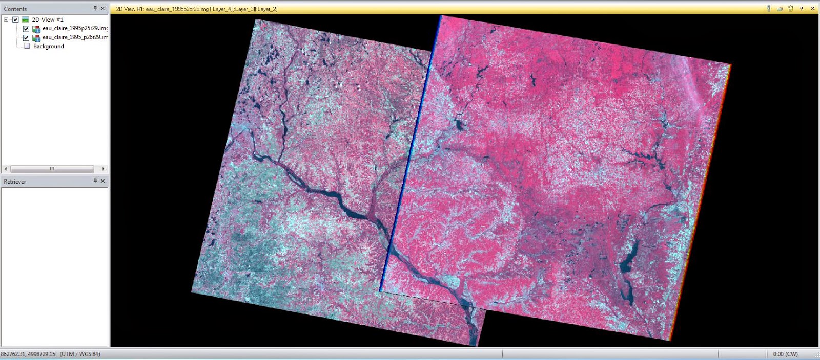
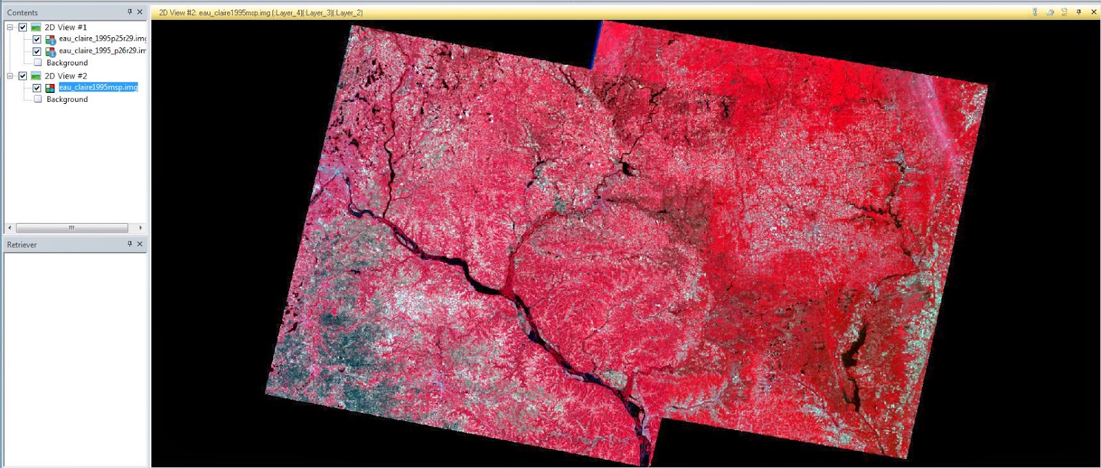
This portion of the lab involved creating a stereoscopic image using an orthorectified image and a DEM (Figure 4) of the city of Eau Claire.  Using the Anaglyph Generation tool in ERDAS, the DEM and the image were input and an output of a stereoscopic image was created (Figure 5), which can be viewed when wearing Polaroid glasses.


The left is the orthorectified image of Eau Claire, WI while the right is a DEM of the same area.  These two images were input in the Anaglyph Generation tool to create Figure 5.  (Figure 4)

This is a screenshot of the anaglyphic image output.  When viewed with Polaroid glasses it can be seen that the lack of accuracy in the DEM may have caused the lack of accuracy when compared to reality of this image.  The wooded area of Putnam Park is extremely steep and changes elevation rapidly, this was hard for the DEM and the stereoscopic image to account for.  (Figure 5)

Part 3:

This large portion of the lab involved orthorectification of images using ERDAS Imagine Lecia Photogrammetric Suite (LPS) (Figure 6)
.
This is the LPS window after the image to be orthorectified has been input, though the image can't be seen yet as Ground Control Points (GCPs) need to be collected. (Figure 6)

Two SPOT satellite images of Palm Springs, California were required to be orthorectified.  LPS Project Manager was opened and the imagery needing to be orthorectified was added after ensuring that all settings in the project were set to ideal values.  From here the Classic Point Measurement Tool (Figure 7) was opened to collect GCPs on the first image of Palm Springs.  The reference image was then brought in (Figure 8).  The reference image in this case was an image of Palm Springs which had already been orthorectified.


The Classic Point Measurment Tool can be used to orthorectify an image by creating GCPs and generating tie points.  Here, the input image that is required to be orthorectified can be seen.  (Figure7)
The previously orthorectified image which was used to place GCPs can be seen to the left, while the first Palm Springs image that is required to be orthorectified can be seen to the right.  From here GCPs were added back and forth between the two images.  (Figure 8)

A total of nine GCPs were collected between these two images (nine on each image).  Another separate reference image was then added in order to ensure accuracy and a final two GCPs were added.  The GCPs then had their Type and Usage changed to Full and Control to properly designate the points.  A DEM was then brought in to create a z (elevation) value for the GCPs.

Some of the set control points are listed here.  The x and y references were set using the two orthorectified reference images while the z reference was set using a DEM.  (Figure 9)
The other image that was required to be orthorectified was then brought in and had GCPs were created to help orthorectify both images.  These GCPs used the already placed GCPs in the first image and placed on the second image (Figure 10).  From here tie points could be created.

The triangles represent GCPs between the two images to be orthorectified.  The area where they overlap is where the GCPs will be drawn from to create one output image.  (Figure 10)
Automatic tie point generation (Figure 11) was then run which used the GCPs and created more tie points in order to ensure the images match up well (Figure 12).  Orthorectification was then run with gave a single output image using the two original images (Figure 13).

The Triangulation Tool created tie points between the two images which can be seen in Figure 12.  (Figure 11)
The triangles represent the GCPs between the two images, while the squares represent the locations of tie points generated automatically.  From here the orthorectification was run and an output image was given.  (Figure 12)
The final orthorectified image of Palm Springs, Californina is a combination of the two original images that were required to be orthorectified.  GCPs and tie points were used to ensure geometric integrity between the two images.  (Figure 13)

Discussion:

The process of creating the final orthorectified image was rather painstaking and required the use of a large amount of GCPs and tie points and a high degree of accuracy.  However, this paid off greatly as the two input images fused together almost seamlessly (Figure 14).

It is almost near impossible to tell where one input image ends and the other begins.  This is a zoomed in view of the orthorectified image at the border of the two original input images, and all of the features clearly match up extremely well.  This is due to the high degree of accuracy of the GCPs and tie points and points to orthorectification as being a powerful tool in remote sensing. (Figure 14)

Conclusion:

All of the skills learned in this lab are extremely technical.  Not only that but they are extremely useful and powerful as well.  Knowing how to do what was learnt in this lab well can lead to obtaining a job as orthorectification and the other skills learnt are extremely useful.  It's rare to find people who possess the knowledge and skills to perform these tasks.  This lab taught these skills well and they should be repeatable in the future by any member of the class who completed them.

Thursday, April 17, 2014

Lab 6: Geometric Correction

Introduction:

This lab was designed to introduce the class to geometric correction.  Geometric correction is performed when an image is distorted from what it should be in reality.  There are many different kinds of geometric correction, most of which require the use of a reference image and ground control points (GCPs) to correct the geometry of the distorted image.  In this lab two types of geometric corrections were run that are typically performed on satellite images as part of pre-processing to prepare an image for analysis.  These two types are image-to-map rectification and image-to-image rectification.


Methods:

Image-to-Map Rectification:

The first portion of the lab involved bring two images of the Chicago area into ERDAS (Figure 1).  One of which was a slightly distorted satellite image, while the other was a reference map of the same area.  The image-to-map rectification method involves using GCPs to correct geometric errors in the image.  GCPs are locations on the Earth's surface which can be identified both accurately in imagery and on a map as well.  A GCP is placed on the distorted image, and then subsequently a GCP is placed in the same location on a map.  It's important to spread the GCPs throughout the image in order to best apply the geometric correction.

This is a view of the two images of the Chicago area.  The image on the left is an aerial image with slight distortion; while the image on the right is a reference map of the same area which was used to geometrically correct the image on the right.  As can be seen in this picture, GCPs have already been set at this point.  (Figure 1)

The tool to place GCPs is under the Multispectral menu under the option "Control Points".  From here the geometric model needs to be selected.  This lab required the class to use the polynomial method in order to perform the geometric correction.  The aerial image of Chicago only is slightly distorted so only a first order polynomial was required to perform the geometric correction.  Images with larger distortion require larger order polynomials to perform the correction properly.

At this point GCPs were set going back and forth between the distorted image and the reference image.  The GCPs were set in areas that could be easily identified in both images (Figure 2).  After the GCPs were set it was important to check the RMS error (Root Mean Square).  This is a value that represents the distance between the input location of a GCP and the re-transformed location for that same GCP in the rectified image.  Typically an RMS error of less than .5 is desired but in this case only a GCP less than 2 was required.  Once the RMS error is less than 2 (Figure 3), the image can be resampled.  This resampled image is a geometrically corrected image of the original distorted image (Figure 4).

The GCPs were set in locations that were easily identifiable in both images so they could be set in the same geographic locations.  In this case GCP #1 was set in the corner of what appears to be a harbor area as the feature stood out well in both images.  (Figure 2)

The GCP properties are shown below the two images.  The RMS error of each GCP is displayed here as well.  Though the toal RMS error is displayed in a different location at the bottom right of the screen.  A minimum of only three control points are required for first order polynomials.   (Figure 3)

The final, resampled image should be geometrically correct if GCPs are placed well and the RMS error is low.  This is the geometrically corrected aerial image of Chicago which was the output of the first part of the lab.  (Figure 4)

Image-to-Image Rectification:

The second portion of the lab required going through the same process as the first portion.  However, this time the image was much more distorted and instead of using a reference map to perform the geometric correction, a previously corrected aerial image was used.  The two aerial images given were of an area in Sierra Leone.  When placed in the same viewer and viewed using the Swipe tool it can be seen that the image that hasn't been geometrically corrected is extremely distorted in comparison with the corrected image (Figure 5).  Due to this a higher order polynomial was required when performing the geometric correction, which in turn, required more GCPs.

The two images viewed together using the swipe tool to see them both clearly shows that the images don't match up geometrically.  One of the images is distorted by a large amount and needed to be geometrically rectified using the previously rectified image.  (Figure 5)

As the distorted image had a large amount of distortion, as previously mentioned, a third order polynomial was required to rectify the image.  A third order polynomial requires a minimum of ten GCPs, however, it took twelve GCPs until ERDAS would allow the resampling tool to be run in this case.  These twelve GCPs were placed all over the two images in strategic places that were spaced out far enough and were easily seen in both images (Figure 6).  After the GCPs were placed, they all had to be tweaked slightly to get the total RMS error down to below .5.  This was a painstaking process that required precision with GCP placement.  After this, the resampling was run and a rectified, output image was given (Figure 7).

The GCPs can be seen scattered throughout the images, and their properties can be seen below the images.  The total RMS error can be seen in the bottom right hand corner.  Slight re-positioning of the GCPs had to be performed in order to achieve a total RMS error of less than .5.  At this point the image is ready to be resampled and have a rectified image output.  (Figure 6)

The original rectified image and the output rectified image are shown together here using the swipe tool.  These images are almost geometrically exact unlike the images in Figure 5.  (Figure 7)

Conclusion:

Geometric correction is a majorly important aspect of learning how to properly use remote sensing in almost any situation.  If an image isn't geometrically sound, analysis and data extraction can't be properly performed. The first step in many cases is to ensure the images that are being analyzed are geometrically accurate or have been geometrically rectified.  This lab introduced the class to two common methods of geometrically correcting images:  Image-to-map rectification and image-to-image rectification.  It also taught the class how to properly place ground control points to ensure the most accurate rectification possible.

Thursday, April 10, 2014

Lab 5: Image Mosaic and Other Functions

Introduction:

This lab was designed to help teach and explore image mosaic, spatial and spectral image enhancement, band ratio, and binary change detection.  All of these functions are key in understanding how to best use ERDAS to aid in imagery interpretation and practical applications of remote sensing analysis.

Methods:

Image Mosaicking: 

Image mosaic is taking several separate scenes of satellite imagery and processing them into one seamless scene.  It is performed when a desired study area is larger than the spatial extent of a given satellite image scene.  It is also useful when the area of interest covers the portion of two intersected satellite scenes.  The first portion of this lab involved looking at two satellite images of the Eau Claire area together in the same viewer (Figure 1).  This produced what was clearly two contiguous, but separate satellite images.

As can be clearly seen, the displaying of the two satellite images on top of each other, even though they are contiguous, isn't very advantageous for visual interpretation. (Figure 1) 


From here, the images were mosaicked using a tool called Mosaic Express (Figure 2) under the Raster menu.  Which produced an output that looked almost less useful than the original two separate images (Figure 3).

Mosaic Express is under the Raster menu and is a quick and easy way to mosaic imagery together. (Figure 2)

Mosaic Express produced this seamed together image which unfortunately has a large amount of difference between the two images still even though they now are one. (Figure 3)

MosaicPro (Figure 4), another option to mosaic images together was tried next with much more ascetically pleasing results (Figure 5) thanks to histogram matching, which MosaicPro allows.

This is the MosaicPro window.  It is much more complicated then Mosaic Express, but this allows the use of more tools.  Overall it is a more powerful and useful image mosaic option. (Figure 4)

This is the final output after MosaicPro was run.  The histogram matching option of MosaicPro helps eliminate the border between the two original input images and allows for better visual interpretation of the whole image using color. (Figure 5)


Band Ratioing:

Band ratioing allows for interpreting of images using reflectance properties.  In this lab NDVI (Normalized Difference Vegetation Index) is looked at in order to analyze vegetation amount in the Eau Claire area.  NDVI can be run in ERDAS under the Raster menu (Figure 6).  Running this tool on a LANDSAT image of the area produced a black and white image (Figure 7), with the brighter areas representing larger amounts of vegetation.

This is the Indices tool with NDVI set as the index.  An image can be input here and it will output an image that displays vegetation concentration. (Figure 6)

This is the NDVI image created from a LANDSAT image of the Minneapolis-Eau Claire area.  The brighter areas represent areas of high vegetation concentration, the darker gray areas mostly represent urban areas, and the black areas represent water in this image. (Figure 7)

Spatial Enhancement:

Spatial enhancement involves adjusting the frequency of an image (how much the pixel value changes over a distance).  The images can be adjust to have a lower frequency or a higher frequency depending on what is desired.  High frequency images (Figure 8) have a high amount of change in a small area of pixels.  The frequency can be lowered using the Convolution tool (Figure 9) in ERDAS.  Similarly, low frequency images can have their frequency raised to appear less blotchy.

This is a satellite image of Chicago.  It has a high frequency, which makes it appear too busy in some areas which can hamper visual image analysis. (Figure 8)

This is an image of the Convolution tool in ERDAS.  As can be seen, Low Pass is selected which will lower the frequency of an image. (Figure 9)
Spectral Enhancement:

Spectral enhancement involves stretching out the histogram of an image in order to give the image a larger contrast.  This can be done using many different methods.  Usually the method of stretching out the histogram depends on input histogram mode.  Gaussian histograms, or histograms with one peak, are typically stretched using a maximum-minimum contrast stretch (Figure 10).  This type of contrast stretch simply pulls out the max and min of the histogram to values of 0 and 255.  Non-Gaussian histograms, histograms with multiple peaks) can be stretched out in a piecewise contrast stretch (Figure 11).

This image has had it's histogram stretched using a maximum-minimum contrast method, which is best suited for Gaussian histograms. (Figure 10)

This image has been piecewise contrast stretched. (Figure 11)

Histogram Equalization:

Histogram equalization can be done to improve the contrast of an image (Figure 12 and Figure 13).  It aides greatly in visual interpretation if the image has no contrast and has a histogram that's very concentrated in one area.
The left image is the input image, while the right image is the output image which has been run through histogram equalization. (Figure 12)

The left histogram is extremely concentrated and doesn't show much contrast.  However, the right histogram is the output histogram after histogram equalization has been run.  As can be seen, it covers much more area so it, in turn, has a higher contrast. (Figure 13)

Binary Change Detection:

By analyzing the brightness of pixels in a similar image taken at different times, it can be seen if any change has occurred.  Two inputs (Figure 14) can be run through a tool and have their brightness values subtracted from each other.  In this way, the change in brightness values can be detected and an output image can be created (Figure 15).  This can also be done using a model in Model Builder (Figure 16).  This image can have its histogram analyzed and the areas of change can be found by separating different areas on the histogram from each other depending on the pixel value.  In this case, the portions of the histogram that were found to have changed were less than -25.3 and greater than 71.3 (Figure 17).

The left image is an image from 1991 of the Eau Claire area while the one on the right is of the same are from 2011.  The pixel values of band 4 of the 1991 image were then subtracted from the pixel values of band 4 of the 2011 image.      (Figure 14)
This is the output image that was created by subtracting the two input image pixel values.  This image itself doesn't readily show the change from one year to the other.  Instead the histogram needs to be evaluated. (Figure 15)

Running a model using Model Builder is one way to run equations such as subtracting pixel values.  (Figure 16)

This is a histogram of the output image in Figure 15.  The thresholds of change are pixels with values less than -25.3 and greater than 71.3.  These areas are where pixel values changes in brightness from 1991 to 2011. (Figure 17)

From here, another model can be run to give all pixel values that haven't changed a 0 value and all pixel values that have changed a value of 1.  In this way, it can be seen exactly where there was change by looking at the output image.  This image can then be brought into ArcMap (Figure 18).

This map shows the areas where the pixel values changed between 1991 and 2011 near Eau Claire, WI.  (Figure 18)


Conclusion:

This lab taught many useful functions for processing images.  These functions, when used correctly, are extremely powerful in aiding visual image interpretation.  These functions can also be used to solve a problem or answer a question such as:  Where is the vegetation greatest using NDVI, or where has the most change occurred in the Eau Claire region over the last 20 years using binary change detection.  In a well-trained user's hands, it's obvious that ERDAS and these image functions can be used to answer many diverse questions and issues.